It seems that every time you go to a technology website, you get a pop-up ad about the latest and greatest gadget. Pop-ups are all over the internet, and now I almost expect them! Even though they are intrusive and annoying at times, they are extremely powerful in terms of their ability to help you get your offer in front of a captive audience. And from our research, we’ve learned that offer placement can be critical to the success of your acquisition efforts.
Pop-ups, slide-outs, take-overs: we all hate them, but they work!
How an alternate offer, given at the right time, increased emails acquired
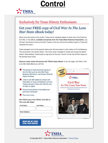
Our first example was a test performed with Texas State Historical Association. Here is their actual email signup page for a Civil War e-book offer. By comparison, the page had a good conversion rate. But even so, the majority of visitors did not convert.
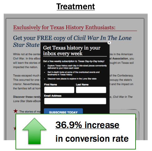
What happens if the visitor isn’t interested in the Civil War e-book? They start to exit the page. Instead of letting them go entirely, we created a pivot offer that would appear as soon as the visitor showed intent to exit, also known as an exit pop-up. This is a relevant but different offer that appears when the visitor brings the cursor to the left or right corner.
In this example, the exit pop-up offer was to receive a weekly email called Texas Day by Day. It offers education on the rich history of the state in bite-sizes pieces, conveniently sent to your email address every week.
The control has only one call to action. The treatment has a secondary call to action, but it displays only when someone indicates intent to abandon the offer or page.
The treatment produced a 36.9% lift in the number of new subscribers.
You might hesitate to take advantage of pop-ups because of how annoying they’re perceived to be. But, again, they work! There’s no harm in giving visitors another opportunity. Whether it’s when they first appear on the page or when they get ready to leave – you can redirect them with a completely different offer.
Relevant offers presented at the right time can increase conversion rate.
How a disruptive offer placement increased email acquisition
This test was done in partnership with Alliance Defending Freedom. We specifically wanted to test email acquisition on their active blog. It receives between 3,000-5,000 visitors each day, and each post ends with multiple calls-to-action. One call-to-action is to donate. The other call-to-action is to sign up for their email list.
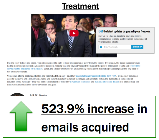
Data told us the email signup offer was more successful in than the donate option in terms of conversion. We isolated this email offer and created a slide-out ad. Our hypothesis was the offer placement was keeping most blog readers from seeing it.
In our treatment, we also included value proposition language that identified the benefits of giving an email. The button text was also changed to communicate more value. As the visitor scrolled near the bottom of the page, the subtle slide-out appeared from the right.
After conducting an A/B split test, we discovered a 523% increase in the number of new email subscribers by adding this more disruptive technique!
Wrap Up…
Compelling content by itself is not enough. We need to present our captive audience with timely, compelling offers. Yes, pop-ups are annoying. You probably hate them, and we do too. No one goes to a website hoping one will appear. But there’s a reason why we use them: they’re powerful!
Sometimes there needs to be a disruption on the page that will position our offer to the right person at the right time. There are a lot of ways to create more opportunities to grow your email file with this strategy. The goal is to create more traffic to your email signup offers, which will increase the total number of net subscribers onto your file.


