John Cornyn has served as a U.S. Senator from Texas for more than 14 years and is the current Senate Minority Whip for the 113th Congress.
Our team connected with Josh Eboch, political director for Team Cornyn, when we partnered with him to present a webinar on activating donors through social media. Josh expressed interest in the science behind web optimization, and proposed a test to see if we could increase donor conversion on JohnCornyn.com.
The Challenge
As election season begins, a torrent of traffic comes to JohnCornyn.com. This traffic includes likely voters looking to confirm their affiliation, donors looking to support the Senator, and people seeking information about all of the candidates. The team wanted to make sure that friction and anxiety were minimized and credibility and clarity were increased so that the most motivated potential donors would make a gift to support the Cornyn campaign.
The Test
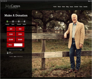
Initially, the donation page was plain, with little in the way to increase donor motivation or increase donor confidence — just a picture of the Senator and a four-step donation form. Due to campaign finance regulations, this page is required to have a large disclosure statement on the page. This was immediately visible, and the team hypothesized that it might be a factor that increased donor anxiety. One of these statements in particular was somewhat jarring to the donor experience: “Your contribution cannot be accepted unless each statement applies to you. If you are not able to affirmatively answer each question, you are not eligible to make an online contribution to Texans for Senator John Cornyn Inc.” This raises all sorts of questions in the mind of the donor: “Am I eligible?” “Am I going to get in trouble?” “Is this illegal?”
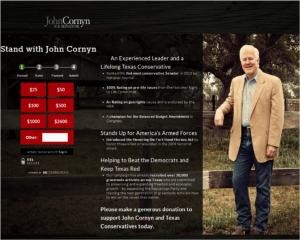
The team formed a hypothesis that adding the correct amount of value proposition language from Senator Cornyn’s resume alongside the page would increase donor conversion by increasing motivation and pushing the copy that presumably caused donor anxiety further down the page and away from the donation form. We knew we had a lot of value proposition language to work with. Factors were added that would appeal to potential donors: experience and affiliation. The team also added a few points from his Senate voting record, and his history of standing up for veterans. Copy around his campaign messages was included to reinforce some of the likely messages the prospect had seen in their inbound path (“Beat the Democrats”, “Keep Texas Red”), and then placed a direct ask at the end of the messaging.
After the Cornyn team spent some time making the page fit the design of the rest of the site, a new treatment was launched.
The Results and Key Takeaways
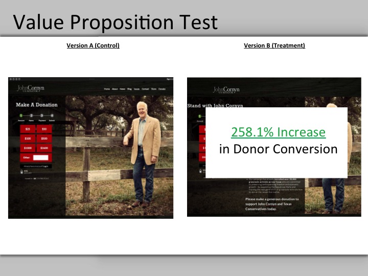
The new treatment delivered a 258.1% increase in donor conversion, with a statistically valid sample size. Josh Eboch noted that “we could now expect to convert more than three times as many visitors into donors, which in turn means a more invested and engaged supporter base for our campaign. Everyone on the team was thrilled with the results and excited to keep improving.”
Team Cornyn learned a few things about their donor base through this test:
1. Experience matters. Even though the donor might be motivated to get to the donation page, they need to be reminded throughout the process that Senator Cornyn aligns with their core beliefs and is worthy of their donation. Donors to Senator Cornyn are thoughtful — they can’t be expected to just react to a donation opportunity, they must be persuaded along the way.
2. Design matters. Simply adding the copy to the page hurt results. Keeping continuity in the user experience throughout the entire donation process is crucial to a positive lift.
3. The learnings are transferable across other media. Eboch commented: “[these] results can be applied to anything from email acquisition to persuasive messaging experiments. We will continue to apply these techniques wherever possible moving forward to ensure we maximize effectiveness throughout the campaign.”
The first step to optimizing your site for more donations is understanding where your donation funnel needs to improve. That’s why we put together a free report to show you how your site stacks up against nonprofit benchmarks on the three key metrics that drive revenue: traffic, average gift, and conversion rate. Grab your free, customized report here.


